The 'Boekenbeurs' is no more... But don't worry, because from now on there is Lees! The book festival, with a completely new approach, look & feel and ready for every kind of reader!
Creative briefing
The 'Boekenbeurs' was an annual tradition, a fixture in the literary landscape. That is why Easyfairs decided that this tradition should not be lost. They put their shoulders behind the organization of this 'festival' and set the tone for a new, leading book event - and so much more, because reading is about much more than just a printed book....
A festival naturally includes striking branding that can convey the right atmosphere and that matches the target group. A challenge that we were only too happy to take on!
Behind the scenes
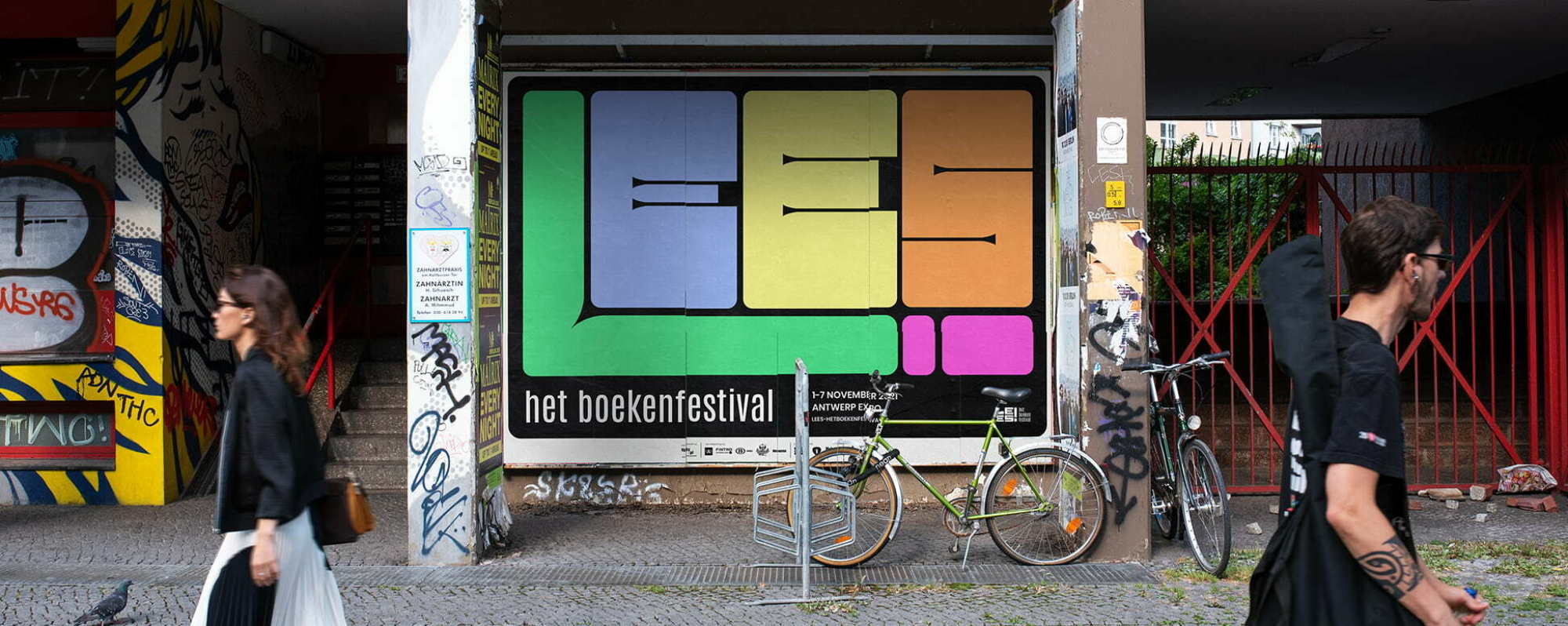
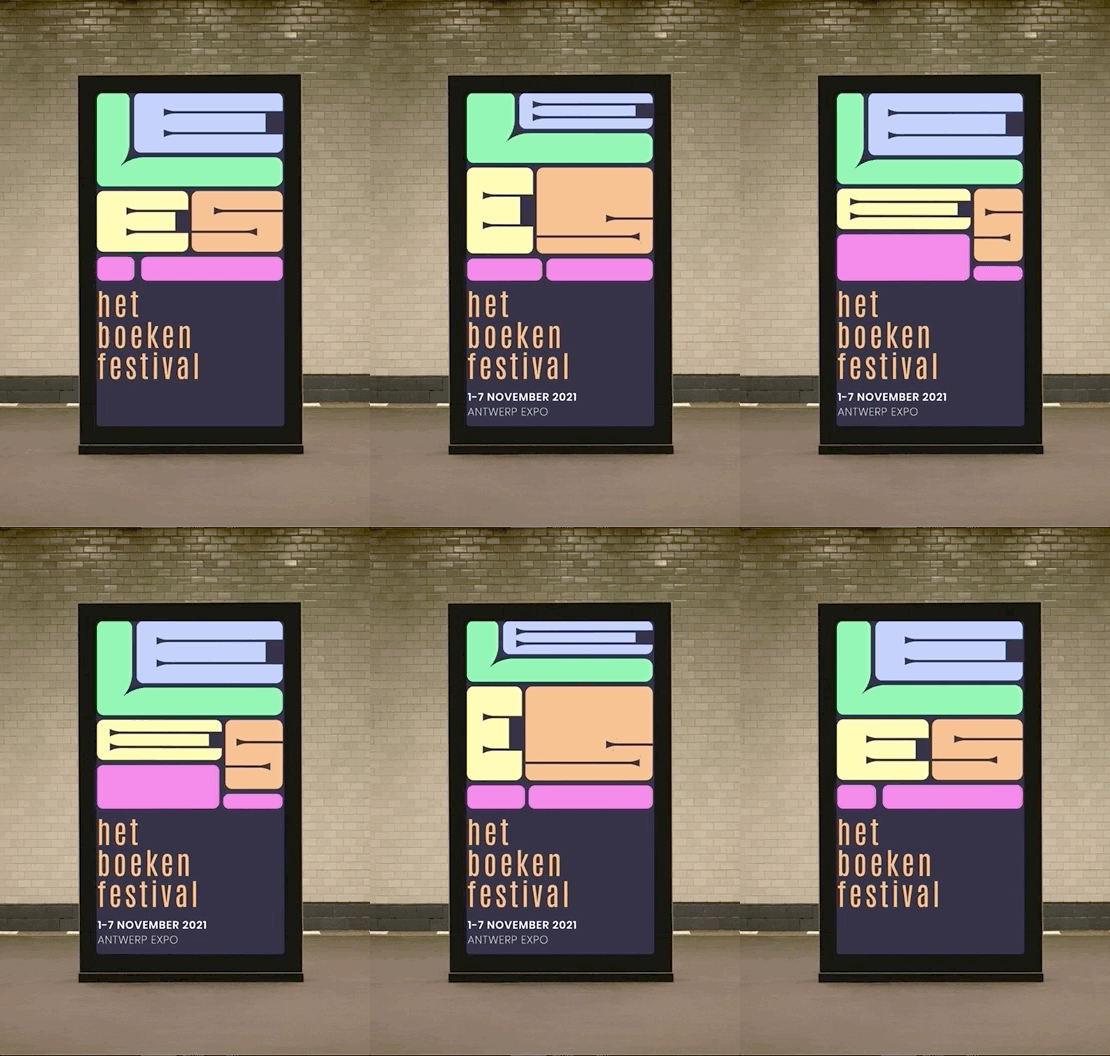
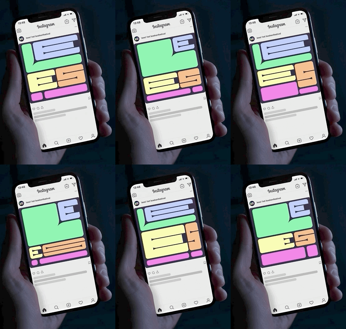
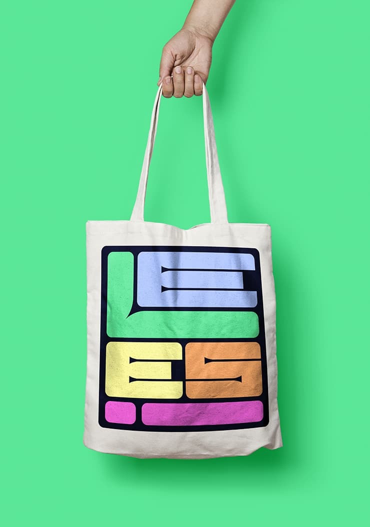
With the campaign image for Lees! We want to set the tone for the book festival for the coming years. The campaign image therefore consists of different layers.
First and foremost we want take the festival visitor, and all diligent readers, into a dream world, just as happens in the stories they read. Moreover, reading is a very broad concept. It can range from novels and poetry, to travel books and cookbooks, to comics and graphic novels. You can also do this in a book, on a smartphone or an e-reader. That is why the emphasis is explicitly on reading and not the medium 'book'.

Dynamic campaign image
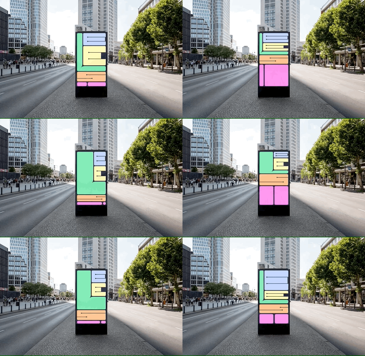
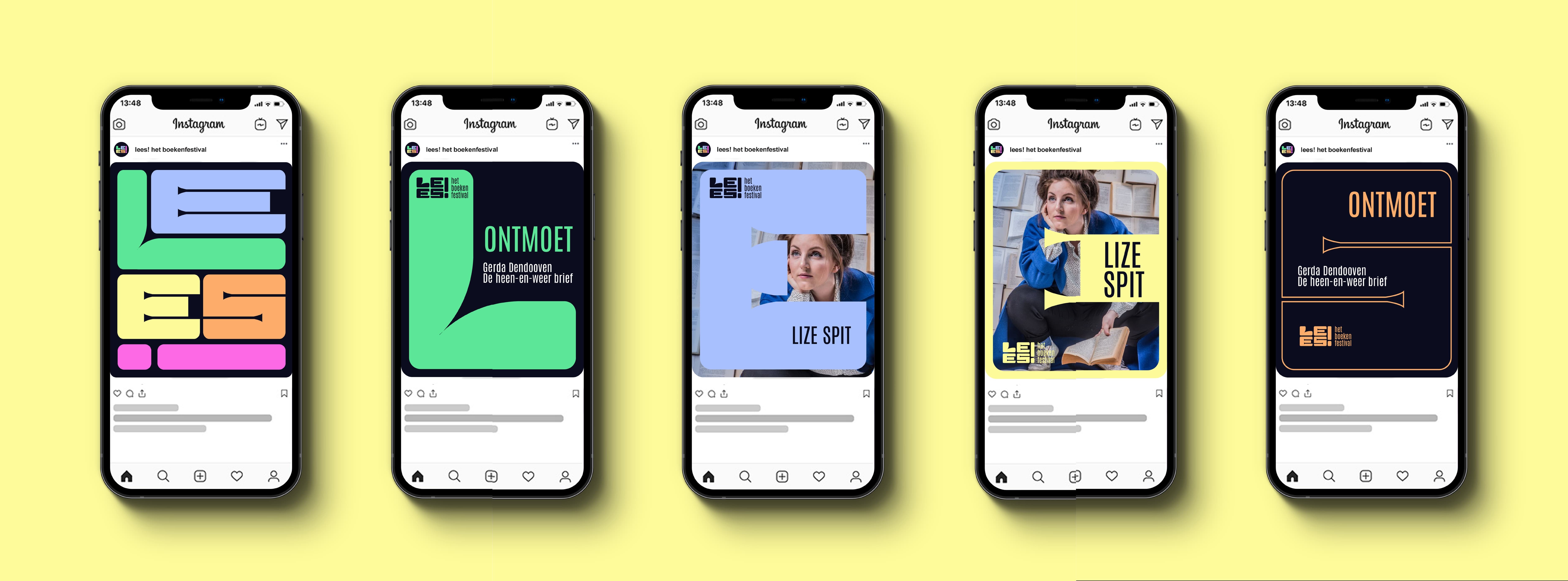
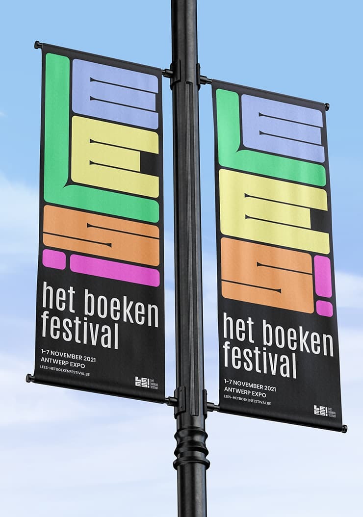
The campaign image is also dynamically structured: the letters always adapt to the available surface. In this way, each variant of the campaign image looks different, with which we want to emphasize the diversity of the readers. Moreover, it was all the more reason to bring the campaign image to life with the help of some motion design.
Winning team
Letterlik / motion design
Let's shape
your story
Don’t wait for that chance encounter. Drop us a line or join us for tea time. The pleasure is already ours!
Contact us